PlainID Platform
Overview
PlainID is an enterprise Authorization-as-a-Service platform that enables organizations to manage and enforce access policies using a dynamic, policy-based access control model (PBAC).
It replaces role-based models with flexible rules that control who can access what, when, and under what conditions.
PlainID integrates with identity providers, APIs, and business applications to provide real-time authorization decisions.
The platform customers include large enterprises users across sectors like finance, healthcare, retail, and tech.
The platform is complex with access needs across cloud and on premise environments.
Challange
The platform had grown complex and unintuitive due to years of feature-driven development. Users struggled with navigation, policy creation workflows, and managing large-scale configurations, especially in multi-tenant enterprise environments.
This is the platform's main page - the first screen users encounter after logging in.
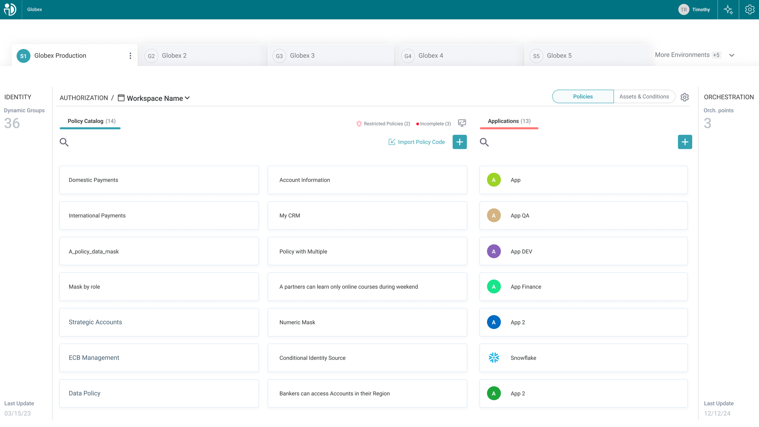
The platform's main screen suffers from multiple UX challenges.
Overwhelming navigation with more then three visible hierarchies (environments, workspaces, and sections), unclear key environment actions, nested tabs, little visual distinction between sensitive environments and more complex ux flows.
Define
The problems in our platform were visible. It was evident from user reactions, feedback, and our own experience using the platform that a restructuring was necessary.
In this project my role is UX UI designer in the product department at PlainID.
Alongside me were an additional designer, product manager, front-end developers, QA, and cross-company stakeholders.
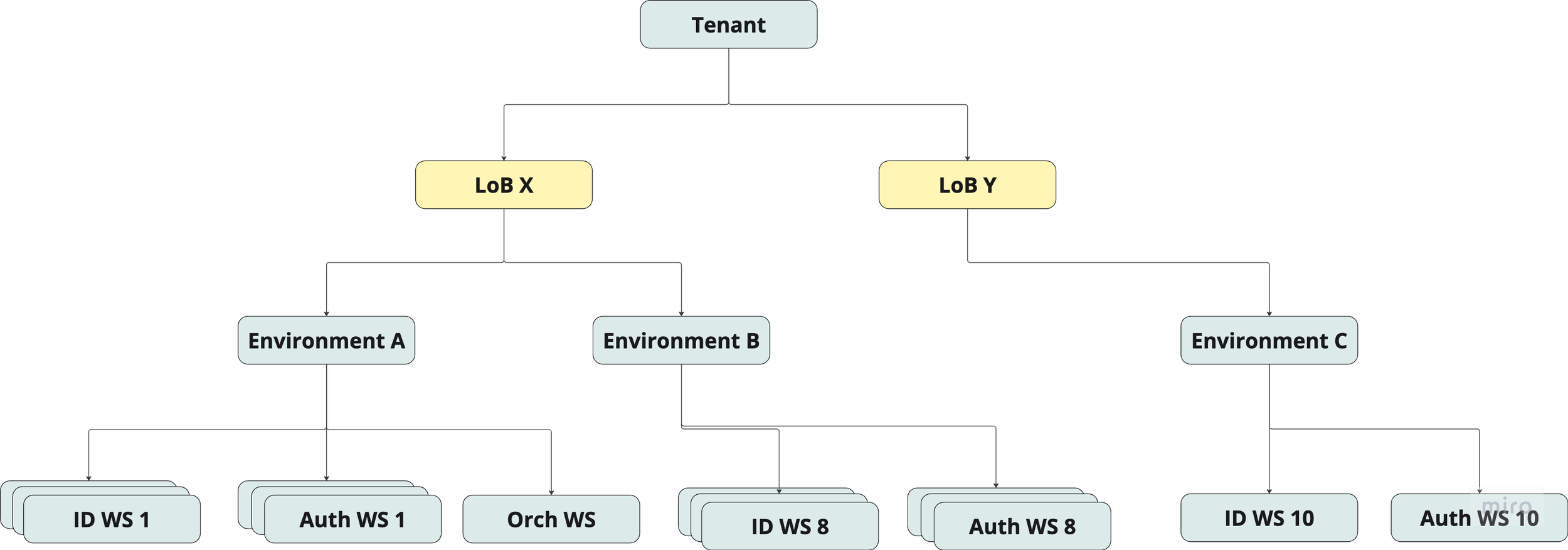
This is a simplified diagram illustrating the new platform hierarchy and structure. The overall UX process was complex - it involved mapping user flows, identifying pain points, and analyzing the existing architecture to design a more intuitive and scalable solution.
Next, I focused on research. I looked into how other complex data platforms challenge UX problems similar to ours, explored best practices for navigation and hierarchy, and gathered visual inspiration to clarify the visual goals we aim to reach.
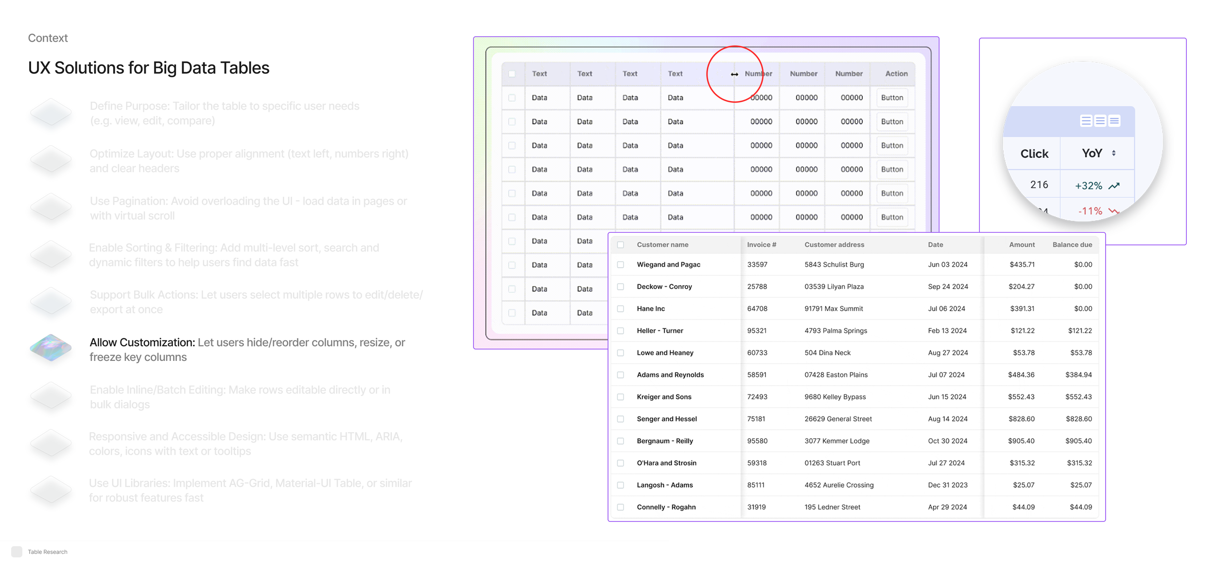
Part of my research regarding big data tables as a potential solution.
Wireframes was the next step.
At this early stage, I used wireframes to quickly suggest and communicate different structural ideas in a clear, simple format. This allowed me to focus on solving one of the core challenges of the platform - improving the navigation and hierarchy, which were major pain points in the existing system.
The platform contains three hierarchy levels: Tenant, Business Unit, and Environment.
Each has its own settings and requirements but must coexist and function together seamlessly.

Part of the initial wireframe that suggests only a two-level menu, combining tenant and business unit at the top.
After the wireframes were more or less agreed on, I moved to high-fidelity screens, combining new components from our evolving new design system. Also, this was an opportunity to see how it all comes together, to evolve the screens into a prototype to understand if something in the user flow is lacking.
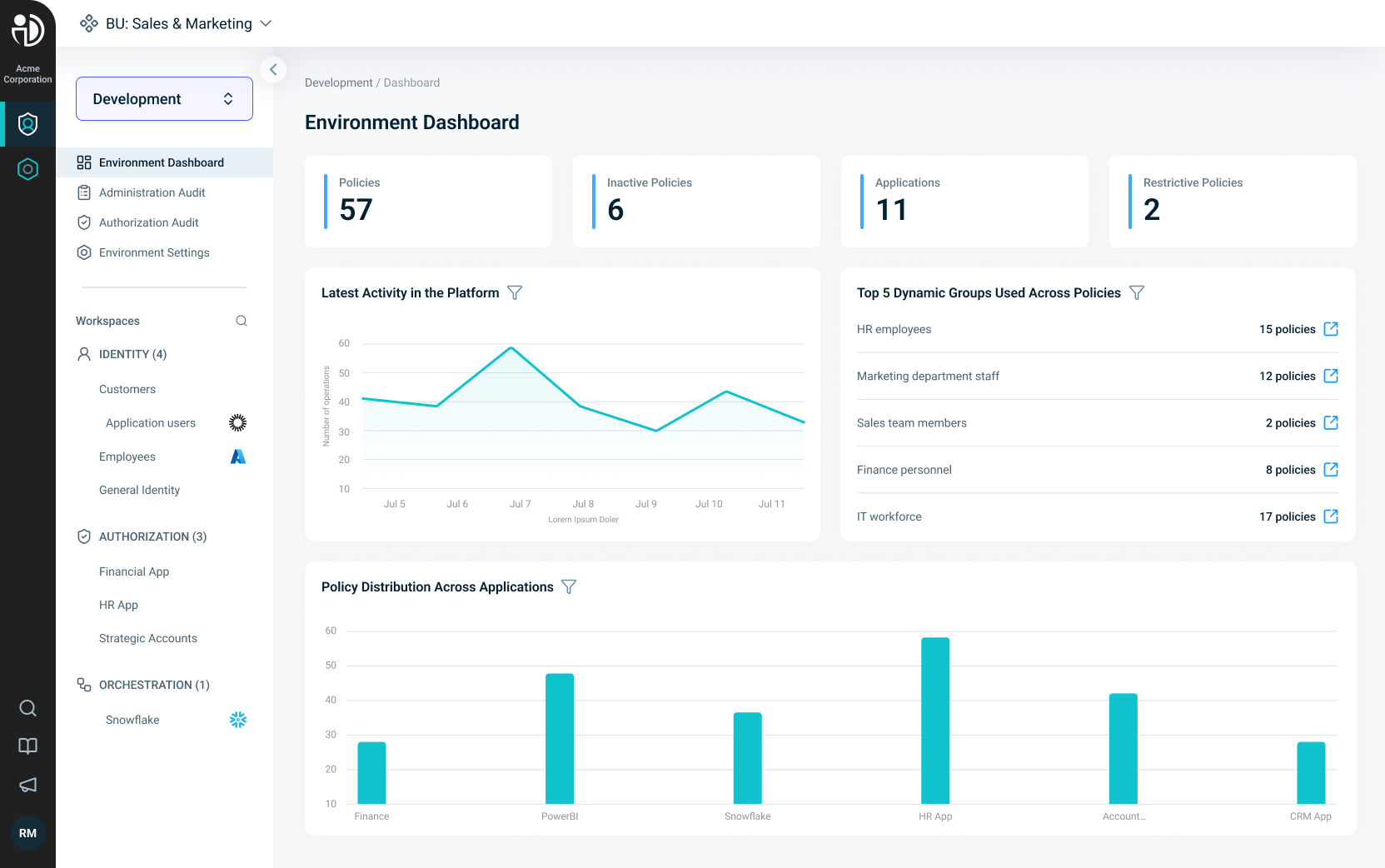
Our main environment dashboard
As we released the platform, we began measuring user feedback and behavioral data. Early Heap analytics showed a 57% increase in task completion rates, a 24% drop in support tickets related to navigation, and positive qualitative feedback from internal users who noted that navigation felt easier and the layout more predictable across the platform.
One of our sales team members had overlooked our emails and updates regarding the upcoming UX UI changes. When he entered a demo session, he was momentarily surprised by the new interface, but noted that even in that unexpected moment, he was able to navigate and present the demo with ease, indicating a well-structured and intuitive design.
As the platform is in production today, we still deal with the challenge of combining new and old design, UI, and several UX flows, some of which are still in various development phases.
It’s an interesting challenge, as it highlights the complexity of design and the importance of collaboration, clarity, and ongoing flexibility throughout the process.