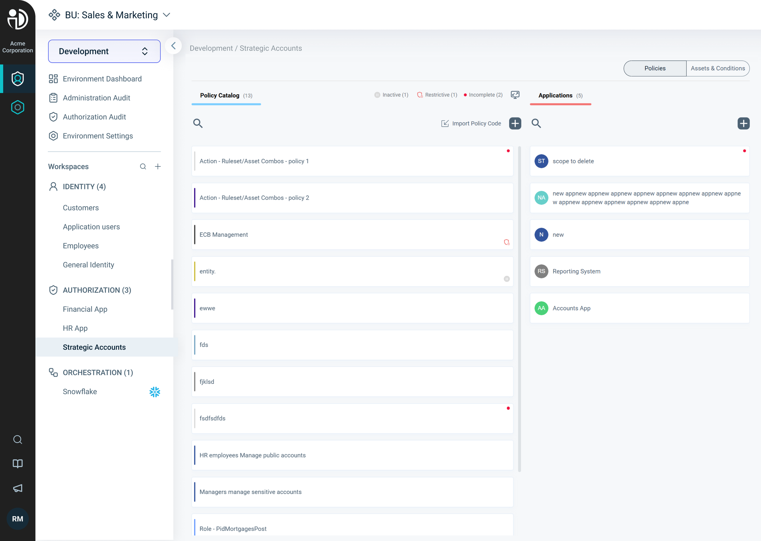
Inner Pages
Now that we’ve launched the new platform structure, the next step is updating the inner pages to match and improve the overall UX and UI. Some pages just needed small UI tweaks, while others gave us a chance to rethink their layout and structure from the ground up.
Challange
The challenges here are diverse. On one hand, we have the external navigation, the new structure, and the updated UI. On the other hand, the PlainID platform is complex, technical, and highly branched. It includes many different user flows, some of which truly needed to be reworked and adjusted.
PlainID Home Screen featuring the new navigation alongside the old inner page of the Policy catalog.
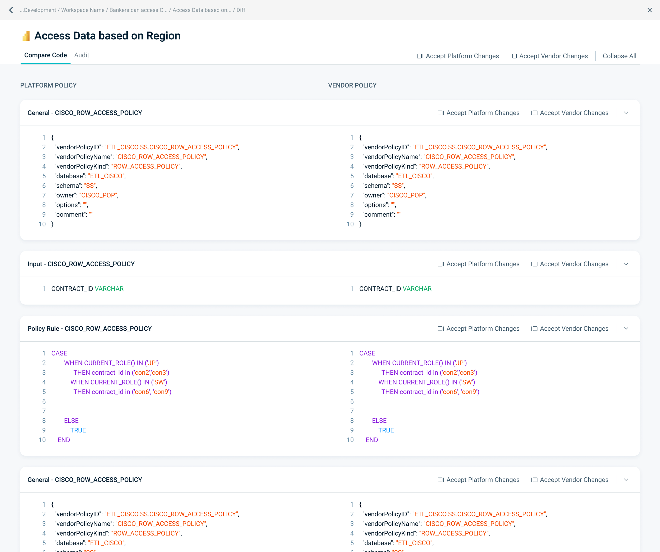
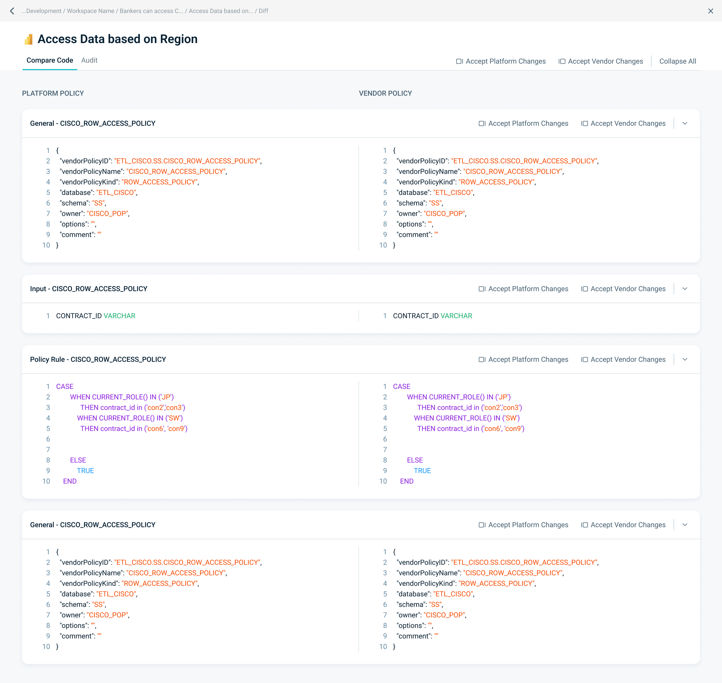
As an example of this large ongoing effort, I will highlight our side-by-side / diff section.
This section belongs to our Orcestration workspace. Orchestration is one of our workspaces that helps bridge the gap between external systems (like Snowflake, Power BI, etc.) and PlainID.
In this section, the name of the policy appears at the top, followed by two sections:
The PlainID policy on the left and the vendor policy on the right. When a mismatch is detected between the two, a warning is displayed above the relevant section. The user must then choose whether to apply the recommended PlainID policy or override it with the vendor’s policy, even if inconsistencies remain.
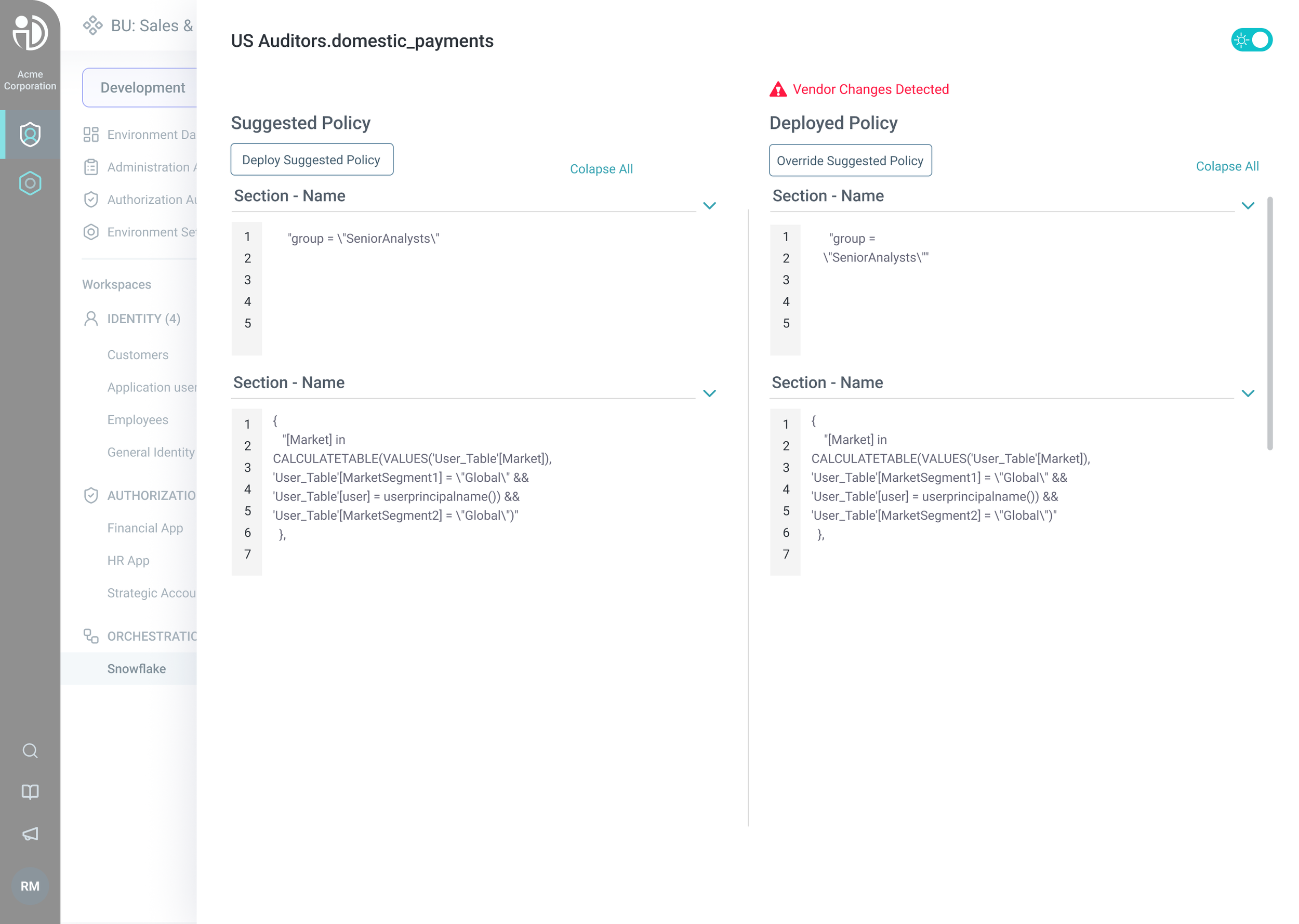
After launching this section, we began gathering feedback and discovered several issues. Users were unsure which button performs which action, and it wasn’t clear which side represents PlainID and which represents the vendor. Additionally, error messages only appeared at the section level rather than highlighting the specific part, but this was due to a technical limitation.
When we began rethinking the structure of the side by side view, I started conducting research. I mainly looked for examples of comparison. How side by side layouts display matching and mismatching elements (diffs).
I also consulted best practices for improving microcopy, all with the goal of creating a clearer UX flow for users.
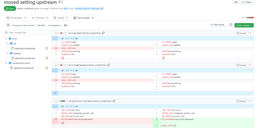
Below are parts of several reference screenshots from related content areas. I was mainly looking to explore code related experiences, as they relate to the functionality of this section.


After we convened, we began with wireframes, quickly exploring different layout options alongside other related content areas for the this section.


As with every development cycle, we quickly gathered information and feedback from various stakeholders and aligned on a final design. This is our diff design with improved microcopy and a cleaner, more concise layout.
This project is an example of great teamwork. I collaborated mainly with two PMs, another designer, and the frontend team.
Before and after: